The Evolution Of The USPS Priority Mail Label
The U.S. Post Office Department launched Priority Mail in 1968, offering a faster domestic shipping option for consumers. In 1971, it evolved into the United States Postal Service (USPS), and when Special Delivery ended in 1997, Priority Mail and Priority Mail Express became the fastest mailing services available. Originally, USPS Label 228 was created as a Priority Mail address label for both domestic and international packages. The very first version of Label 228 debuted in February 1991 with an Olympic-themed design, available both as standard sheets and as printer-ready, tractor-feed versions.
During the 1980s, photojournalist Martha Cooper documented graffiti artists experimenting with commercial name tags as makeshift canvases. Over time, artists gravitated toward USPS Priority Mail labels because of their generous size, easy access, and durable adhesive. Beyond functionality, many graffiti artists used Label 228 to make statements about government systems—though some removed USPS branding entirely to keep the focus on the art.
By the late 1990s, Label 228 graffiti had become a major underground movement. Art critic Hrag Vartanian of Hyperallergic noted that by 2002, “the culture of the postal sticker was well established in the world of graffiti.” Evidence from early-2000s sticker compilations shows Label 228 slaps appearing in cities across the United States as early as 2001.
Throughout its history, Label 228 has been redesigned multiple times—in 1992, 1994, 1995, 1996, 1997, 1999, 2000, 2001, 2002, 2004, 2006, 2008, 2013, 2016, and 2023—amounting to at least 27 different versions. One major update came in 2016, when USPS introduced a vertical layout aimed at reducing misdirected shipments. Despite the new look, many sticker artists still favor the classic 1998 horizontal design, known for its wide white canvas and distinctive blue band across the top.
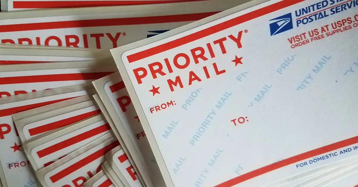
USPS Label 228 is an adhesive sticker issued by the United States Postal Service for marking Priority Mail packages with mailing addresses. The label is provided free of charge at any USPS Post Office or can be conveniently ordered online and shipped to your door.
Because of its easy accessibility and wide blank area, Label 228 has become a favorite medium for graffiti artists and sticker art creators, often referred to as “slaps.” Unlike most commercial stickers, USPS labels are completely free and available in bulk, making them perfect for artists looking to create and share their work without breaking the bank.
The label’s matte surface accepts a variety of artistic media — from acrylic paint, markers, and pencils to inkjet and laser printing — allowing artists to produce everything from hand-drawn pieces to printed runs. Another reason for its popularity in sticker bombing is practicality: Label 228 slaps adhere quickly to almost any surface, making them ideal for fast application in public spaces where artists want to work discreetly.
USPS 1980 Olympics
The 1980 “Miracle on Mailing Device” USPS Olympic Label featured one of the earliest versions of the USPS eagle logo, which at the time was only a decade old. The design proudly displayed the words “Priority Mail” in a forward-leaning, dynamic typeface highlighted by the signature triangular “A,” symbolizing speed and movement — a fitting tribute to both postal efficiency and Olympic spirit.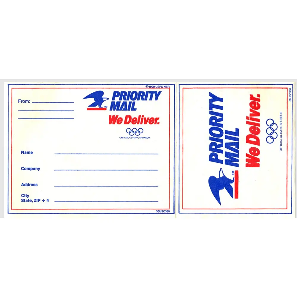
Label 107
By the early 1990s, USPS Label 107 became the standard for Priority Mail shipments. The label retained many of the core visual elements seen in previous designs, maintaining brand continuity. The January 1991 edition marked the final appearance of the red-underlined eagle before it was replaced with a more modern, stylized version in 1993. By October 1997, the usps.gov web address began appearing on labels, signaling the Postal Service’s transition into the digital era.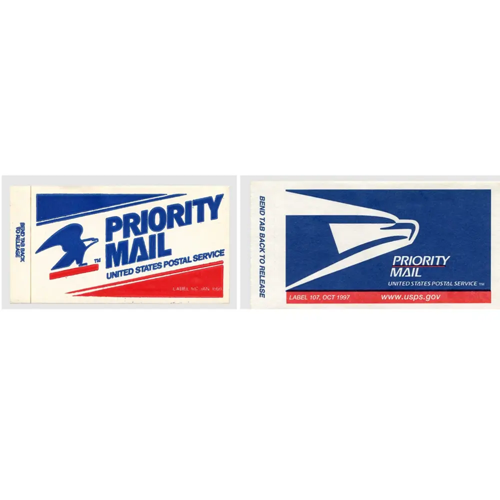
July 1995
The first USPS Label 228 has shadow-like outlines for “to” and “from” that have the feel of a green screen computer interface.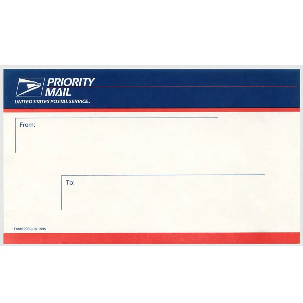
July 1996
The main change here is making the “entry box” less prominent.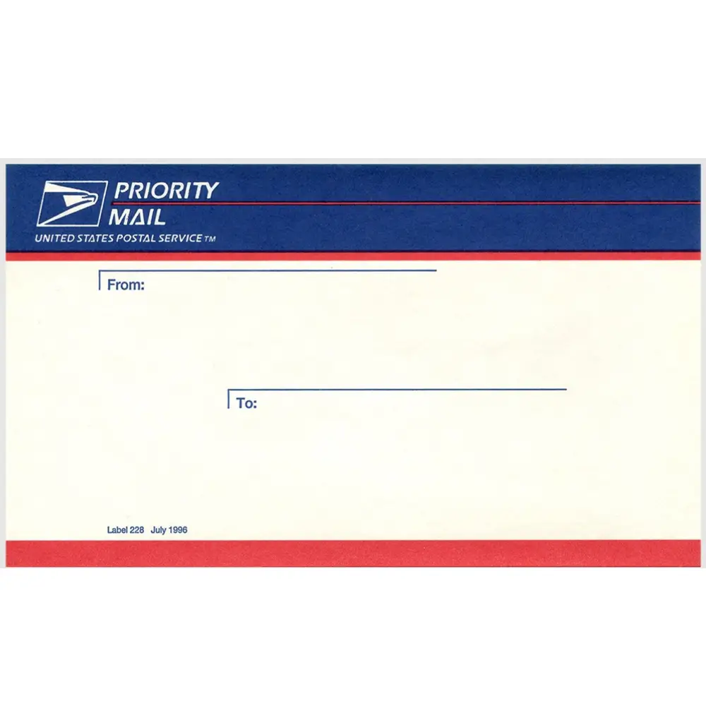
August 1997
Here’s the introduction of the 228 with perforations designed to work with a dot matrix or continuous feed printers.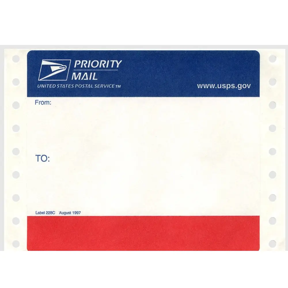
January 1999
This is basically a re-issue of the July 1996 label for the non machine-fed market.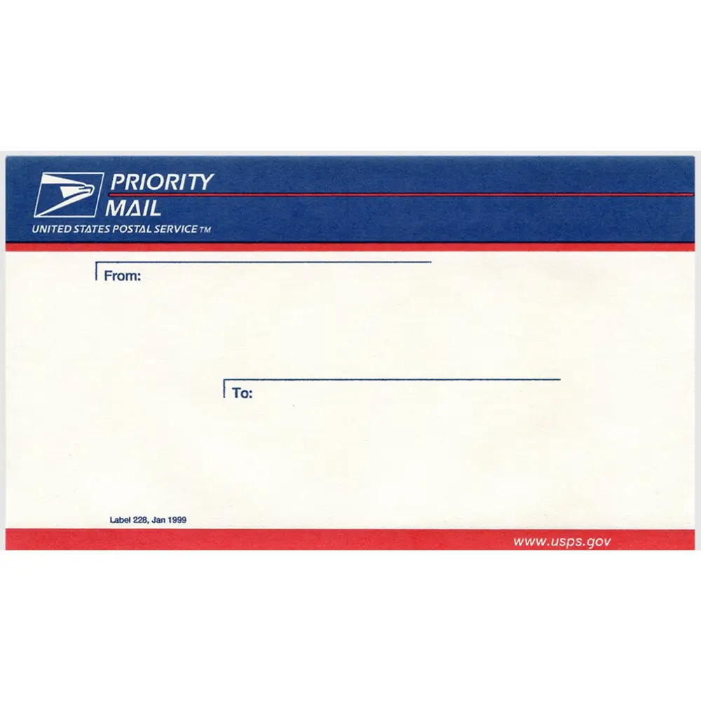
August 2000
A modern take with a larger, more prominent “TO.”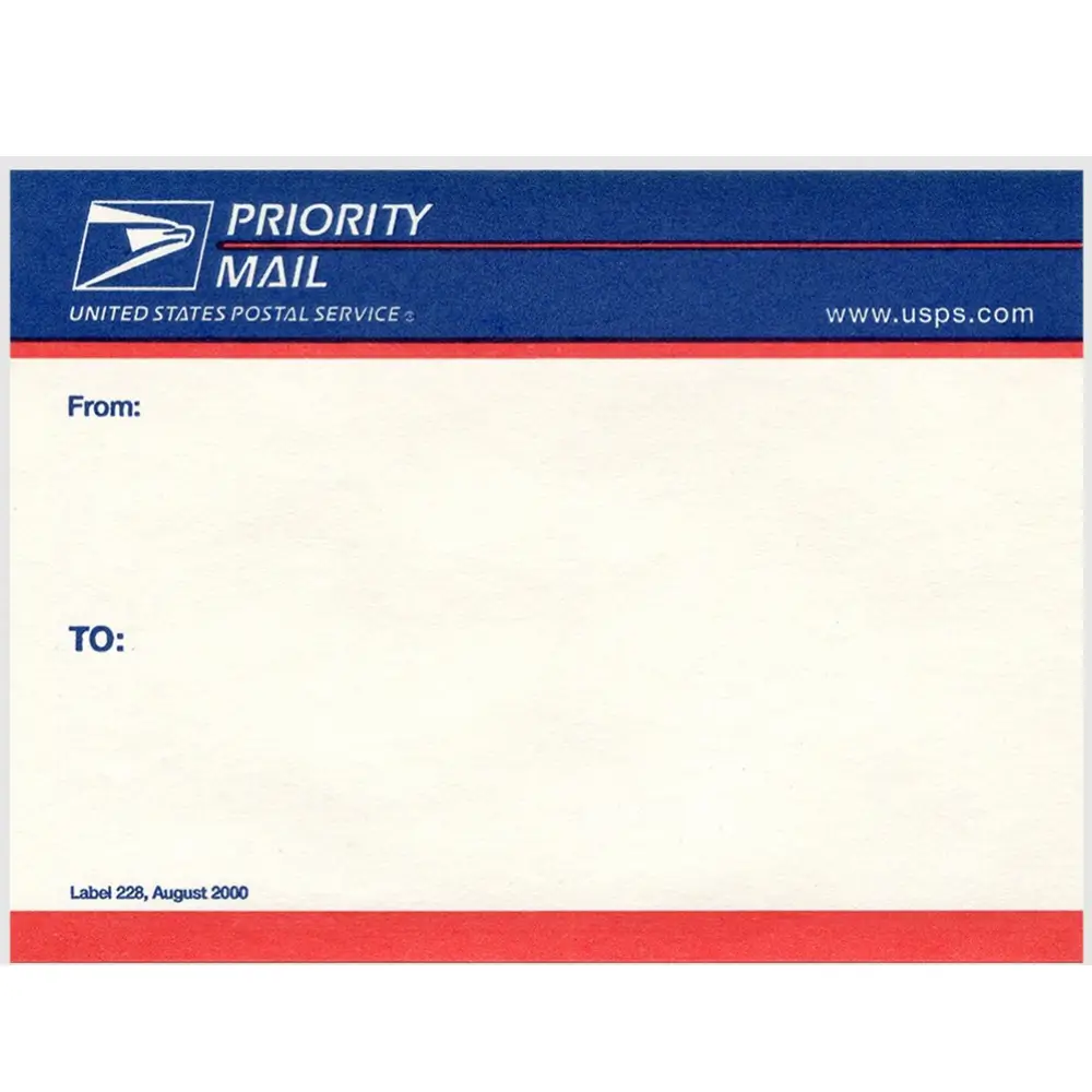
September 2001
For some reason they added two lines for the “From” line with zero chance of anyone legibly placing an address there.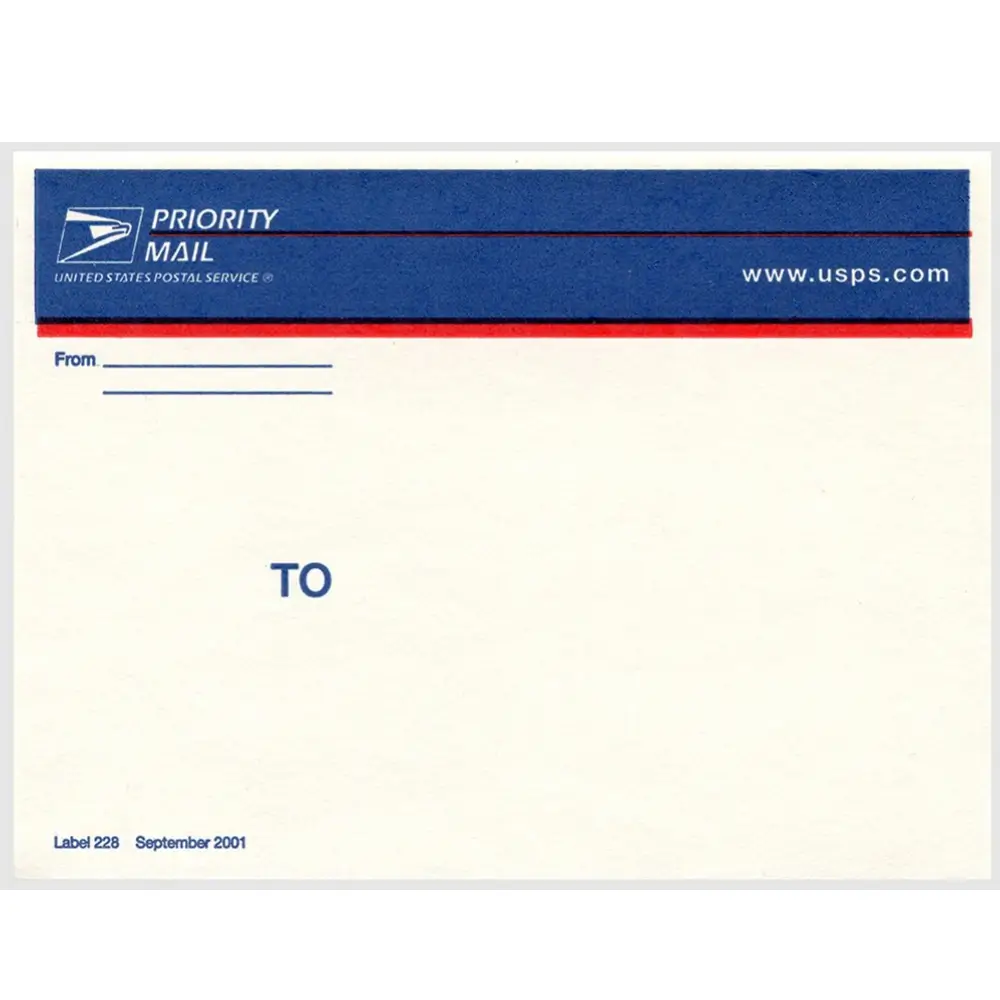
July 2002
No lines near the “FROM” and the “TO” was made even larger than the August 2000 variant.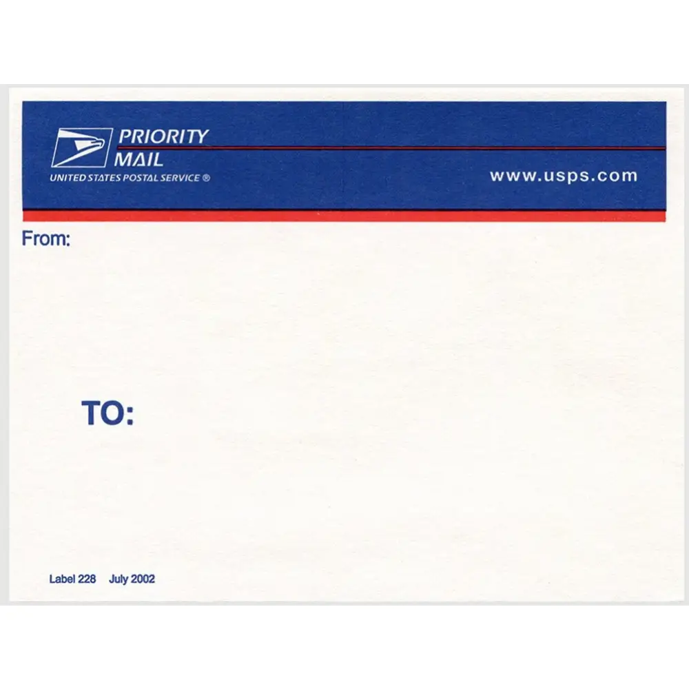
September 2002
A thermal printing variant is made available.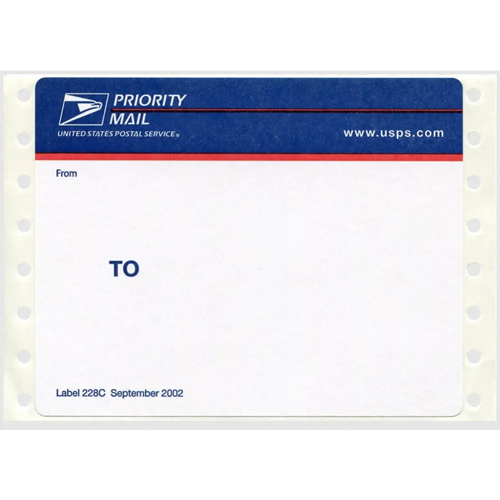
June 2004
First appearance of tilted “Priority Mail” watermark.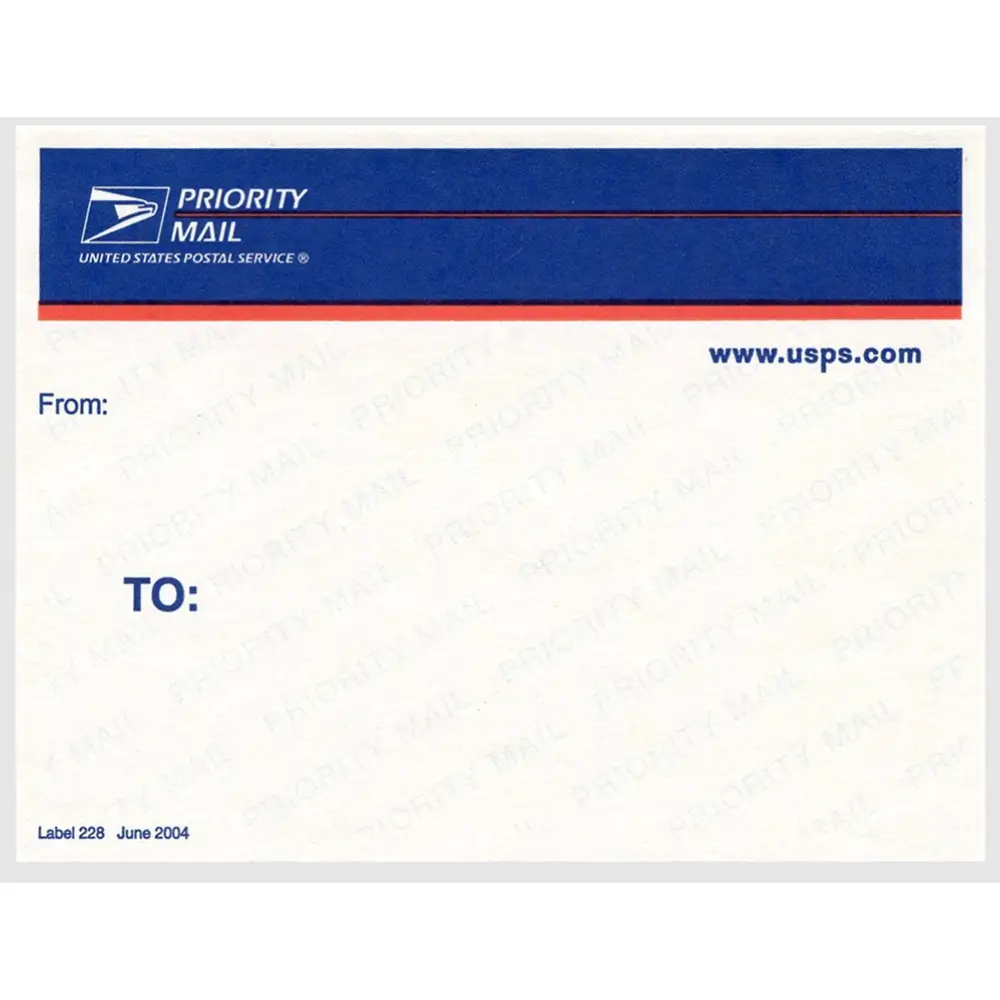
February 2006
Watermark + thermal printing variant is made available.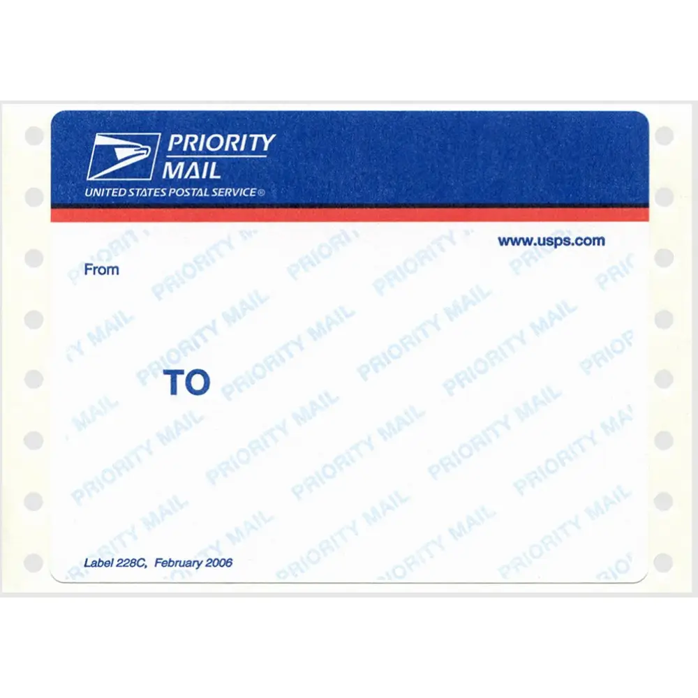
February 2006
A non-printer variant was also released the same year, only the date is in a different location.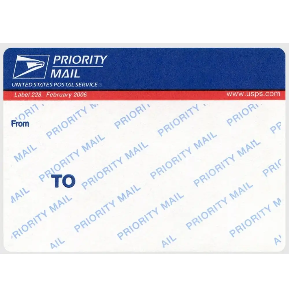
January 2008
The addition, in the upper right, of a visual international component, along with the first appearance of the phrase “For Domestic and International Use.”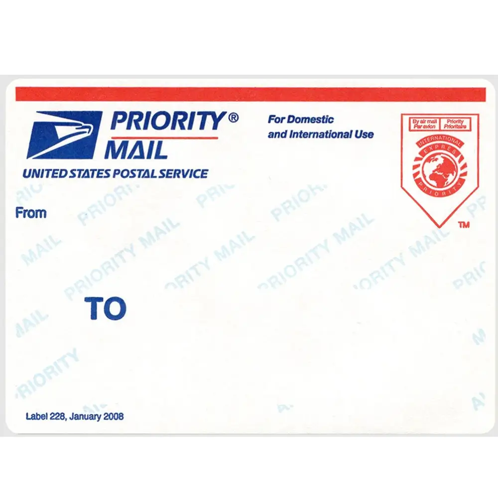
July 2013
The addition of a watermark, removal of the international iconography. This variant would be the last of the landscape labels.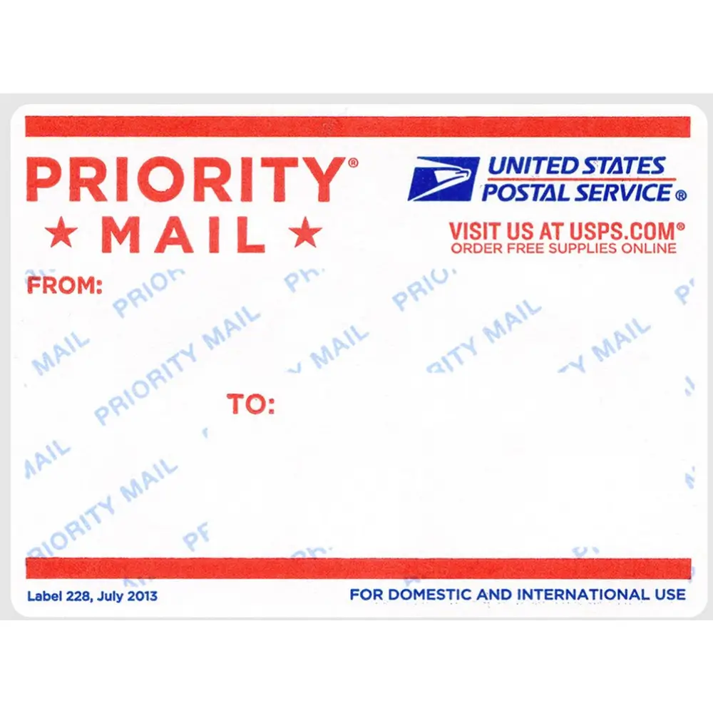
March 2016
The first portrait orientation, with dimensions that map to 18 x 24 posters.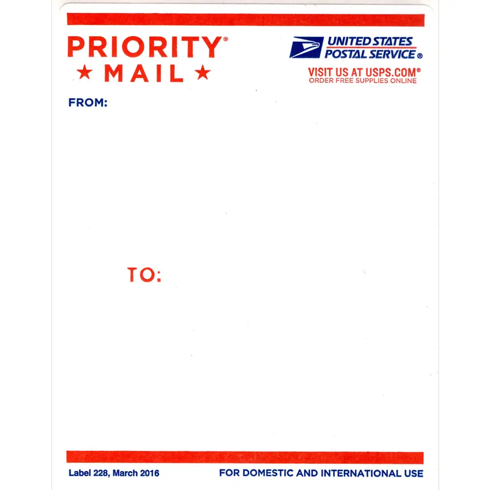
December 2023
A light redesign swapping the two graphic elements at the top & keeping the portrait orientation.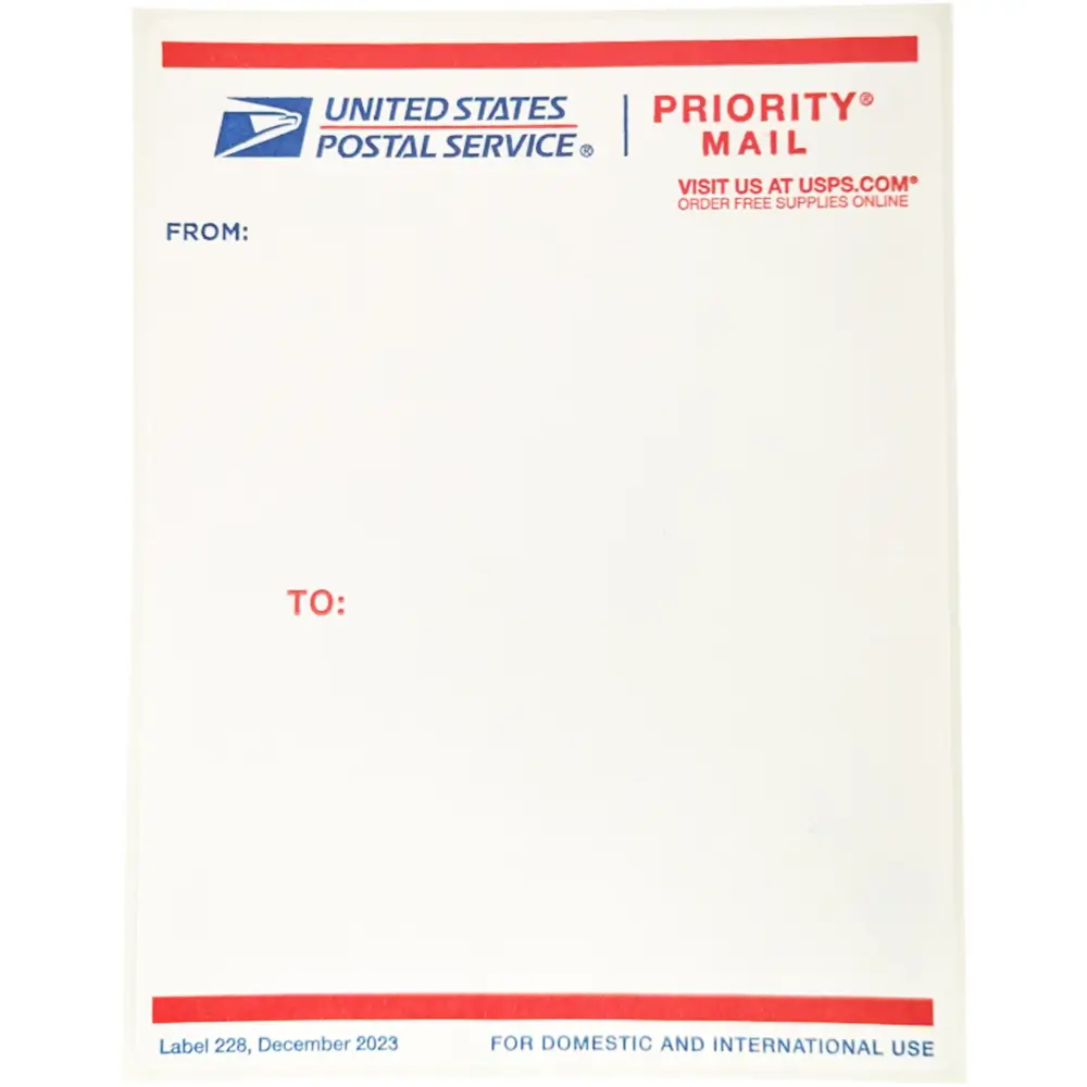
[Research from SLDXO]
For anyone who doesn’t know how to get free USPS Priority Mail Labels, it’s quite simple. Just create an account at the USPS Store, find the Priority Mail labels and order some. They’ll be delivered to your mailbox in a couple days after ordering.
I’m not sure exactly how many you can order nowadays. Back in the day I remember ordering multiple bricks of 500 at a time, back when the Bluetops were still available. Now I’m not sure the max amount available per order, but shit, they’re free & you can’t go wrong with the price or the quality.

